Sunday, October 18, 2009
Robert Sabuda's Work a Unique Blend of Art and Text
Paper Engineer Robert Sabuda is a pioneer in the field of Children’s Pop-Up Books. Since 1994, when he published his first title “The Christmas Alphabet,” Sabuda has not only been pushing the envelope and raising the bar in pop-up publishing, but he has virtually created his own genre. Though there are certainly other pop-up books being published, very few can compete with the sophisticated engineering of Sabuda’s work. Sabuda’s books, ranging from classic children’s novel adaptations to educational non-fiction titles to ABC books all feature beautifully drawn illustrations in vibrant colors combined with innovative pop-up engineering. The books range from six to eight double-page spreads, each more than an inch thick in order to support all of the behind-the-scenes engineering which make the pop-ups engage correctly. In the center of each spread, a large pop-up springs from the gutter shooting out toward the reader, sometimes as far as seven or eight inches high, as if it were coming to life. On either side of the main pop-up on the outer edges of each side of the spread are four-inch panels of text folded in an accordion style and clipped in place by a small corner holder. Readers unclip the panels and open up the text to read the story and find that the panels, too, have their own smaller pop-ups folded in. This method of putting the text in panels on the outside of the pages is an original Sabuda idea and is done only in his pop-up books. It is an innovation which allows him to build eye-popping center-spread pop-up feats while still maintaining room for the text. His books, which are three times as thick as any other pop-up book (about three inches wide) because of his elaborate pop-ups, are easily identified on bookstore shelves and have even become collector’s items, both for children and adults. Children delight in the eye-popping effects, while the adults marvel at the feats of engineering and the uniqueness of the art itself. On his site, Sabuda says "I think pop-ups appeal to adults because it allows them to revert back to their childhood experiences with things that amaze them. When an adult's eyes light up when turning the pages of a pop-up I know they've become big kids again!" (4). That is one of Sabuda's strengths as an artist -- the ability to create that child-like feeling of amazement in every reader of his works, no matter what the age. This excitement then impels the reader to go on with the reading of the text, thereby fostering that important synergistic relationship between the art and text.
But, Sabuda’s pop-up work is not just about creating eye-popping effects. It is also a way of enhancing the text of classic children’s novels. Just as author and artist William Blake uses his printing plate technique to combine the text of his poetry with his illustrations in order to create one cohesive artistic whole, Sabuda uses his pop-up engineering to create a synergistic relationship between art and text. He makes his illustrations into larger-than-life, interactive representations of the text, which bring the scenes to life, engage the reader more fully in the text, reinforce the themes of the text and allow the reader to see in real-time a three-dimensional representation of the story. In the article “Evocative Books: Books that Inspire Personal Response and Engagement,” published in the February 2005 issues of Reading Teacher, authors Catherine Kurkjian, Nancy Livingston, Kevin Henkes, Robert Sabuda and Lisa Yee talk about how pop-up books can “add, extend and develop the theme of the book and enhance aesthetic response in dramatic ways” (481). The excitement of seeing what is going to pop-up next makes the reader more engaged in the story: “The reader is propelled through the text to find out what will pop-up next” (481). At the same time, by seeing an important scene reenacted in three-dimensional space, the emotional impact and deeper themes become more apparent: “[Pop-ups] delight readers, demand attention, and cause the reader to think more deeply about how the pop-up relates to the text” (481). In Sabuda’s pop-up interpretation of Lewis Carroll's Alice’s Adventures in Wonderland, for example, Alice’s courageous decision to jump into the rabbit hole, which can be interpreted as her leap into the unconscious mind or into the chaos of adult life, is further enhanced by Sabuda’s accordion-style pop-up which literally allows the reader to look down into a tunnel, like a kaleidoscope, and see Alice tumbling into the darkness. In addition, the fear and confusion Alice experiences when she drinks the potion that makes her grow bigger (which could be representative of the confusing period between childhood and adulthood when such “growing pains” are experienced), is further enhanced by a three-dimensional representation of Alice’s large body stuck inside the small house: “We identify and gain insight into Alice’s physical discomfort at being too big when we peek into the window of the three-dimensional house and see her pained expression” (481).
Sabuda takes the concept of interpreting text in an artistic way one step beyond illustration, making it not just an artistic rendering of a scene from a text, but a larger-than-life, three-dimensional pop-up illustration of that scene. It’s almost like reading your favorite book and watching a movie of the book at the same time. The text and the visual are combined to enhance the experience and give a more well-rounded, cohesive whole.
Work Cited:
Kurkjian, Catherine; Livingston, Nancy; Henkes, Kevin; Sabuda, Robert and Yee, Lisa. "Evocative Books: Books That Inspire Personal Response and Engagement." Reading Teacher. February 2005. 480-488.
Photo credit:
http://authors.simonandschuster.net
Thursday, October 15, 2009
The Wonderful Wizard of Oz: A Commemorative Pop-Up
Sabuda's inspiration for his first pop-up adaptation of Frank L. Baum's The Wizard of Oz, came from his early pop-up experiments as a child. According to New York Times writer Chris Hedges, who wrote about Sabuda in his article “Public Lives; In Him, Storyteller Meets Architect,” Sabuda’s first attempt at making his own pop-up was unsuccessful: “’I made my first pop-up book when I was 9,’ [Sabuda] said. ‘It was ‘The Wizard of Oz.’ I spent weeks on it. I couldn’t get the cyclone to spin around’” (2). As an adult, however, Sabuda did get the cyclone to spin -- in spectacular fashion. It is the first pop-up image in his pop-up adaptation of The Wizard of Oz that came out in 2000, and its whirling effect cannot help but induce amazement in his readers. In fact, the book's unique look and intricately engineered pop-ups quickly caught the attention of the public and put the book on the New York Times bestseller list, a rare feat for a Children's book, and especially a pop-up book.
Some of the most eye-catching spreads include not just the spinning cyclone, but also an elaborately designed Emerald City and a reconstruction of the wizard's hot-air balloon, which pops up and spins in the gutter of the double-page spread and even shows the basket hanging down from the balloon with the wizard standing inside.
The book was so sophisticated in its look and engineering, it even caught the attention of adults. In her article "Boing! Pop-Up Books Are Growing Up; Flaps, Foldouts and Complexities Attract Adult Eyes," New York Times writer Doreen Carvajal talks about the book's appeal to older audiences: "pull-tabs and double wheels are moving frenetically to attract grown-ups" (1). She goes on to explain in detail the book's unusual engineering and the attraction that engineering has for adults as well children, even going so far as to call Sabuda's works "paper sculptures": "Sabuda has designed a kinetic book of iridescent paper sculptures that shifts from a whirling tornado to a floating hot-air balloon and a byzantine Emerald City castle of towers and cupolas that spreads across two pages. A pair of green spectacles is helpfully tucked away in a side pocket for the reader" (2). The green spectacles are just one example of Sabuda's child-like design sense, which kids love, and adults appreciate because it makes them feel like a kid again. By putting on the spectacles, the already spectacularly designed Emerald City pop-up, looks as though it is completely shrouded in green.
To see a video of the inside of the Wizard of Oz on youtube: http://www.youtube.com/watch?v=T2CI8wuvw4o
Photo credit: http://www.nccil.org
Alice's Adventures in Wonderland: A Pop-Up Adaptation
Sabuda's interpretation of Lewis Carroll's classic children's story Alice's Adventures in Wonderland literally brings the story to life in ways no other illustrated interpretation can. At the end of the book, for example, Alice's skirmish with the Queen of Hearts and her army of playing cards, is depicted in an unusual style as hundreds of individual cards fly above Alice's head in a chaotic arc. The pop-up is fascinating in and of itself, but the interpretation also reinforces the novel's underlying themes of chaos and madness. In addition, the eye-popping artwork reinforces the feeling of excitement the reader feels when reading the text by adding an additional element of surprise and wonder to the experience.
YouTube website: http://www.youtube.com/watch?v=IUOs7heNfrk
New York Times review: http://www.nytimes.com/2003/11/16/books/children-s-books-ready-for-her-close-up.html
AWARDS
- ALA Notable Children's Books
- Bank Street Best Books of the Year
- Booklist Editor's Choice
- Kirkus Editor's Choice
- New York Times Best Illustrated Children's Books
- New York Times Book Review Notable Books
- Nick Jr. Family Magazine Best Books of the Year
- Oppenheim Toy Portfolio Platinum Award
- Publisher's Weekly Best Books
Robert Sabuda Background
"When someone opens a pop-up book and goes 'Wow!' they are really affected by the magic of a pop-up and amazed that they have the power in their hands to make it happen because they themselves are turning the pages." -- Robert Sabuda, RobertSabuda.com
Once upon a time ... children's pop-up books were simple. They had a moveable flap here, a small, single pop-up there. Then came Robert Sabuda. Sabuda is a pioneer in the small-but-growing field of pop-up books, or as it is now called thanks to Sabuda's intricate work, paper engineering. His books are an example of the beautiful harmony that can emerge from the blend of text and art. Sabuda interprets the works of his favorite children's stories -- Alice in Wonderland, The Wizard of Oz, the Chronicles of Narnia, Peter Pan -- and turns them into three-dimensional works of art that, literally, bring the stories to life before the reader's eyes.
Sabuda was born in Pinckney, Michigan, and according to an article on the National Center for Children's Illustrated Literature (NCCIL) website, first learned the art of three-dimensional construction from his father, who was a mason and a carpenter. But, his first interest in pop-ups came when he went to the dentist as a child and saw the pop-up book “The Adventures of Super Pickle” in the waiting room. He was so enthralled with the interactive nature of the book, that he then began to make his own. Sabuda’s attraction to pop-ups came from the idea of combining his favorite stories with his artistic talent and his engineering mind. On his website, Sabuda says “Even as a young boy I enjoyed making little books that I could fill with stories and pictures” (1).
According to an article written by Paul Maniaci on TheCareerCookbook.com website, Sabuda's interest in pop-ups led to his going to Pratt Institute of Art and Architecture in New York and getting an internship at Dial Books where he began doing 2-D illustrations for children’s books: “I walked in and I knew this is what I wanted to do, there wasn’t even any question … The fact that you could use pictures to tell stories” (Maniaci 2). But, 2-D wasn’t quite exciting enough: “I was still working in two-dimensions, but I was working in paper a lot. I was doing paper collage and paper mosaics in my picture books. I thought this is great working with all these different techniques with paper, why not try something 3D?” (Maniaci 2). That led to his first job where he illustrated a book of Henry David Thoreau’s Walden. That lead to more and more jobs and more freedom: "As I became more well known I was able to go on a limb with some techniques. I was still working in two dimensions, but I was working in paper a lot. I was doing paper collage and paper mosaics in my picture books. I thought ... why not try something 3D?" (Maniaci 2). This led to his first pop-up book, Christmas Alphabet, published in 1994. Eventually his work and his name became so well-known in the publishing industry, he was able to start his own studio in New York and concentrate solely on pop-up books.
But creating pop-up books is not all fun and games. It's a difficult challenge, in particular for Sabuda who does such intricate pop-up work. On Sabuda’s website, he says the most difficult challenge in creating a pop-up book is not making it pop-up, but making it fold back down: “making it pop shut is the real challenge” (4). On the website, Sabuda says it takes six to eight months to create one pop-up book, largely because a lot of the 3-D work and engineering has to be done by hand. He talks about the attention to detail required to create a pop-up that not only pops up, but also folds back in in an easy way that keeps the child from focusing on the mechanics and instead keeps them focused on the story: “For the most part, the reader is oblivious to the ‘technical’ aspects of a mechanical book … and that’s the way it should be. They shouldn’t be focusing on the ‘how’ of the book, they should be enjoying the book for the sake of the experience” (4).
And then there’s the production side – which is done by hand in factories in Thailand or China: “Everything is printed overseas. It's die cut so all the pieces come out and then everything is folded and glued by hand into the book” (Maniaci 4). That requires a large staff of workers at the plant. On his website RobertSabuda.com, Sabuda says that "A typical hand assembly plant may have between 500-1500 workers assembling pop-up books" and that "about 10,000 to 15,000 books can be made per week" (3). This also means, however, that Sabuda's books cost more than the average pop-up book: "The manufacturing cost of a pop-up book is about 1/4 the selling price. So if a pop-up book sells to the public for $20, it should cost about $5 to make" (3). In the Maniaci interview, Sabuda says he tries to make the expense worth it to the parents: "If they have a book that is interactive or exciting in a nontraditional way, that will be acceptable to a parent who is going to buy an expensive book for a child" (2). One final concern that consumers have about Sabuda's books is that the intricate pop-ups are too delicate for children. Sabuda goes on to say in the interview that "We try and use strong paper ... We try not to design them delicately if we can" (5). But, Sabuda stresses on his own website that the delicacy can also be a way for kids and parents to connect: "Sometimes pop-ups can be delicate, but that's what makes them so wonderful. The more delicate it is, the more fantastic it usually is. If a parent is concerned about their young children handling a pop-up book, it's the perfect opportunity for them to sit down and SHARE the book with the child" (2). In this way, too, the parents can help the child see the connections between the pop-ups and the text in the story.
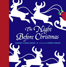
Finally, there’s the artistic side. Sabuda does all his own illustrating for his books, though he works with his partner Matthew Reinhart on the mechanics and engineering. (Reinhart himself is an accomplished paper engineer and recently completed a pop-up version of the Star Wars series in which pop-ups of Luke Skywalker and Darth Vader actually use light sabers that light up.) Sabuda says he only does artistic representations of favorite texts: “I usually only work on stories or subject matter that interests me” (1). The passion in his projects is readily apparent from looking at the finished products. New York Times writer Leonard S. Marcus says in his review of Sabuda’s Night Before Christmas that “it’s hard not to want to believe in the aliveness of everything” (2). That is where Sabuda’s blending of artistry and text works so well. It literally brings beloved stories and characters to life, making the story more interactive and wonder-inducing.
Sabuda also designs certain pop-up books in all white, to divert the attention from the colors to the designs: "I usually work in white when I want the pop-ups to be viewed as just shapes. I don't think they really need to have color to convey my creative vision. This works especially well with books that take place in the winter" (1). The result is a more subtle, but also more classic and artistic look which calls particular attention to the intricacies of the designs and the cuts. In his article “’America the Beautiful’ and ‘Liberty’s Journey’: From Sea to Shining Sea,” New York Times writer Ted Chapin talks about the impact of Sabuda’s use of white in his book “America the Beautiful.” In the book, Sabuda uses American landmarks to represent the words of the famous patriotic song, using for example Mount Rushmore to represent the line “purple mountain” or Mesa Verde National Park to depict the “fruited plain.” Chapin applauds Sabuda’s representations and calls the paper sculptures “a series of astonishing images, most of them entirely in stark white.”
Sabuda has expanded his pop-up business to include more than just books. He now also does greeting cards and Christmas-tree ornaments. But, his focus is still on pop-up books. In his interview with Maniaci on TheCareerCookbook.com website, Sabuda says they put out approximately four books per year now on average.
SITES:
1. Fantastic video on youtube where Sabuda and his partner Matthrew Reinhart show how they made all their books: www.youtube.com/watch?v=7PE4CpqAYa8
2. Great site with photos of his studio: http://www.babble.com/content/articles/columns/5minutetimeout/pop-up-books/gallery/
3. New York Times articles:
http://www.nytimes.com/2003/12/09/nyregion/public-lives-in-him-storyteller-meets-architect.html
http://www.nytimes.com/2000/11/27/books/boing-pop-up-books-are-growing-up-flaps-foldouts-complexities-attract-adult-eyes.html
http://www.nytimes.com/2004/11/14/books/review/14CHAPIN.html
http://www.nytimes.com/2002/12/08/books/children-s-books-150754.html
http://www.nytimes.com/1994/05/22/books/children-s-books-the-littlest-pharaoh.html
4. National Center for Children's Illustrated Literature article:
http://www.nccil.org/experience/artists/sabudar/index.htm
5. Sabuda's own site:
http://www.robertsabuda.com/faq.asp
6. Make your own pop-up:
http://www.robertsabuda.com/popmake/index.asp
Photo copyright: Gordon Trice
Works Cited:
Carvajal, Doreen. "Boing! Pop-Up Books Are Growing Up: Flaps, Foldouts and Complexities Attract Adult Eyes." New York Times. 27 November 2000. Web. 17 October 2009.
Chapin, Ted. "'America the Beautiful,' and 'Liberty's Journey': From Sea to Shining Sea." New York Times. 14 November 2004. Web. 17 October 2009.
Heller, Stephen. "Children's Books: Ready for Her Close-Up." New York Times. 16 November 2003. Web. 17 October 2009.
Kurkjian, Catherine; Livingston, Nancy; Henkes, Kevin; Sabuda, Robert and Yee, Lisa. "Evocative Books: Books That Inspire Personal Response and Engagement." Reading Teacher. February 2005. 480-488.
Maniaci, Paul. "Robert Sabuda." The Career Cookbook. 27 August 2006. Web. 17 October 2009.
Marcus, Leonard S. "Children's Books." New York Times. 8 December 2002. Web. 17 October 2009.
The National Center for Children's Illustrated Literature. http://www.nccil.org/ Web. 17 October 2009.
Sabuda, Robert. ed. Home page. RobertSabuda.com. Web. 17 October 2009.
Subscribe to:
Posts (Atom)